-
READ MORE
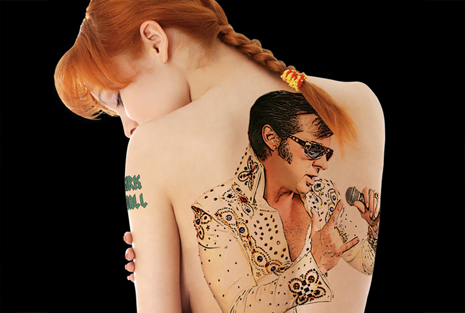
Image for a promotional poster for Kirk Wall.
-
READ MORE
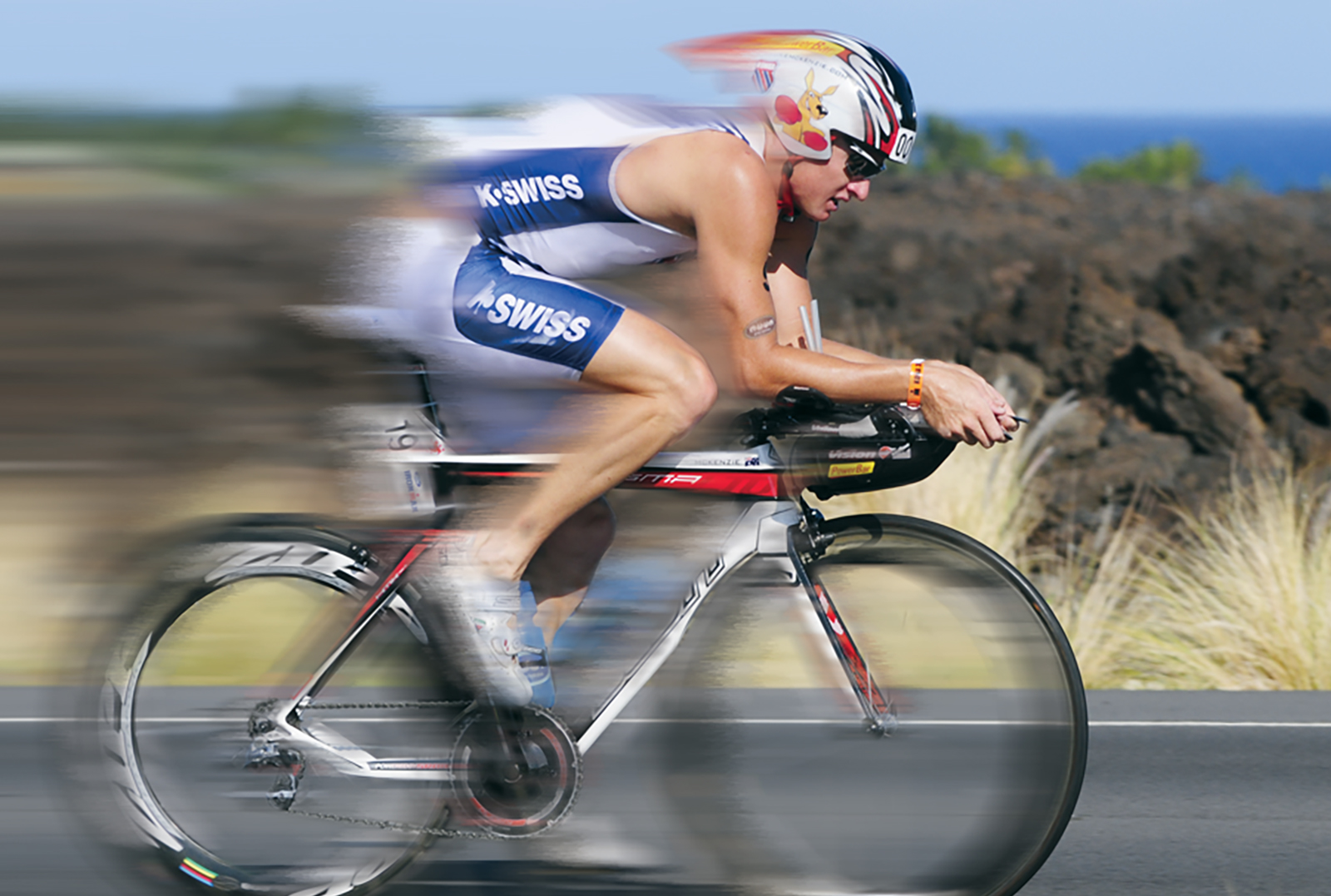
One of my favorite projects. K•Swiss wanted a “coffee table” book to promote their sponsored triathlon athletes. They just handed us a pile of photos and told us to do whatever we wanted with them as long it was “artistic” and interesting. The end result was 38 pages of pure graphic design joy!
-
READ MORE
Logo for a sewing supply store.
-
READ MORE
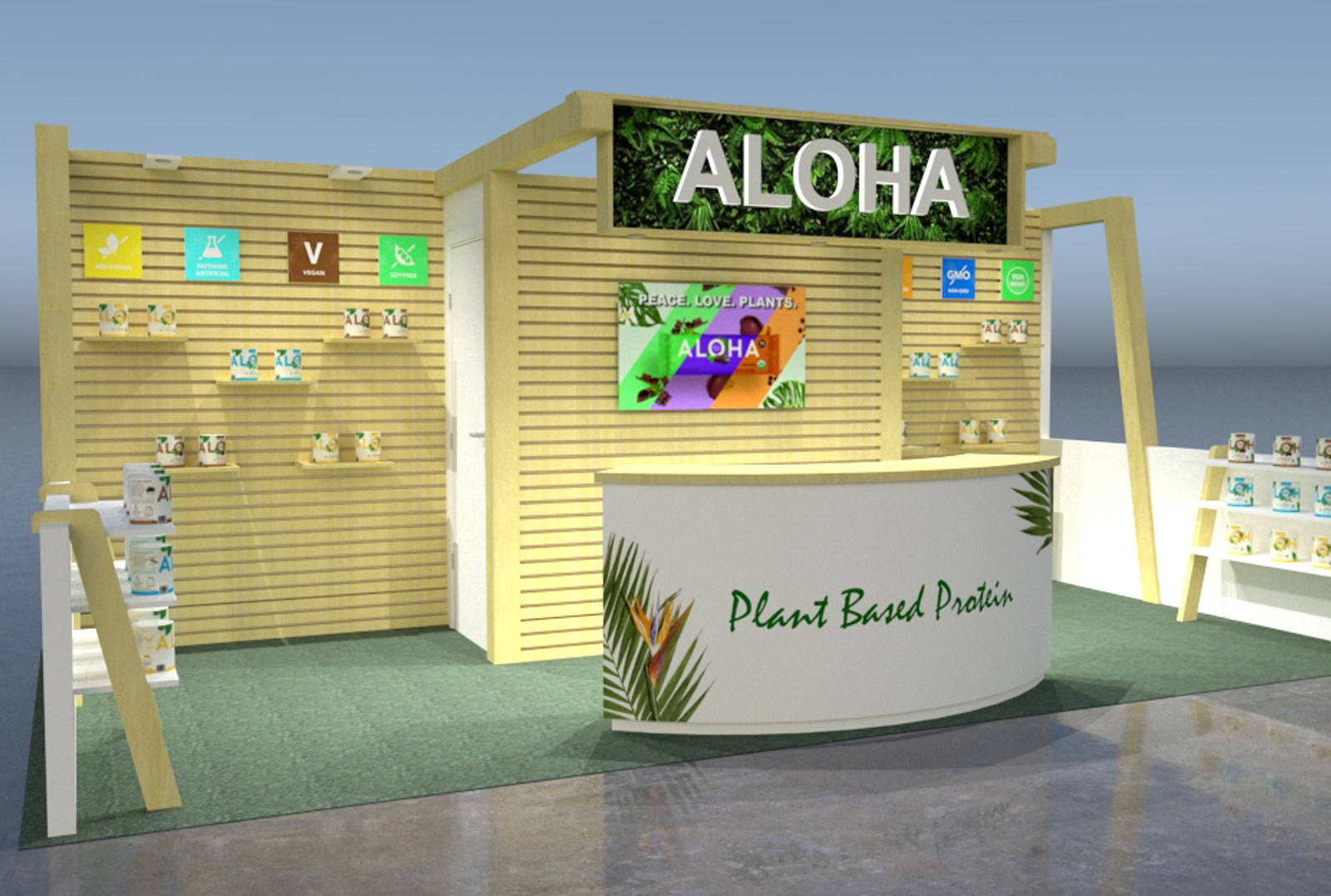
The walls on this booth are clad with 2×2 natural wood to not only give it a fresh, organic look but to also create a moveable shelf system. Graphics, shelves and lighting can be placed literally anywhere on the walls for an infinite number of configurations. There is also an ample storage closet for product.
-
READ MORE
A series of web ads promoting Kirk Wall’s bluegrass Elvis album
-
READ MORE
Manufacturer of lightweight tradeshow booths
-
READ MORE
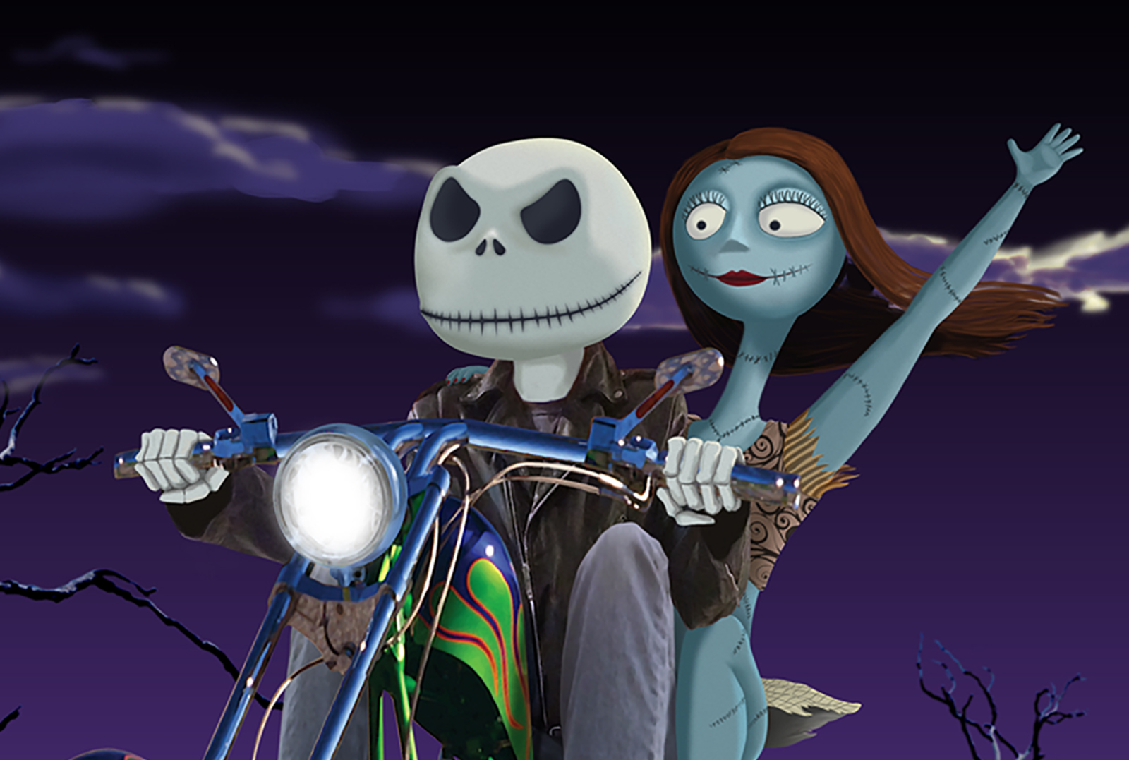
Part photo manipulation, part digital painting, this piece titled “Dead to be Wild” was for a gallery show that was a tribute to Tim Burton. Fun fact: “The Nightmare Before Christmas” is the film most associated with Tim Burton but it was in fact not actually directed by him. It was directed by Henry Selick.
-
READ MORE
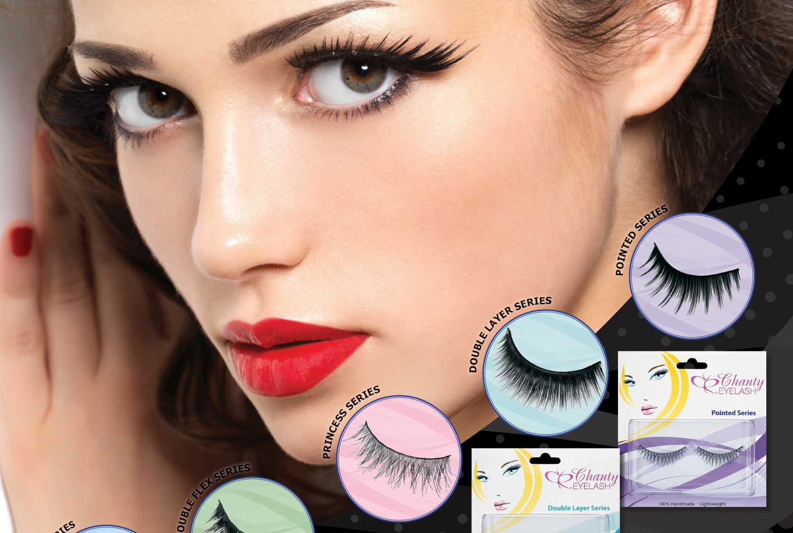
False eyelash packaging. We needed to create a design that contained all of the instructions plus the product all on one piece. The finished product is double sided print and folds pack on itself to create a single card style look.
-
READ MORE
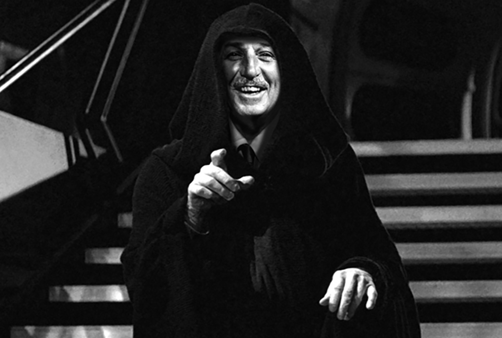
The set is titled “Building Empires”. I created these images for a gallery show that was a commemorating a certain mouse based media empire acquiring the rights to a certain classic space opera franchise.
-
READ MORE
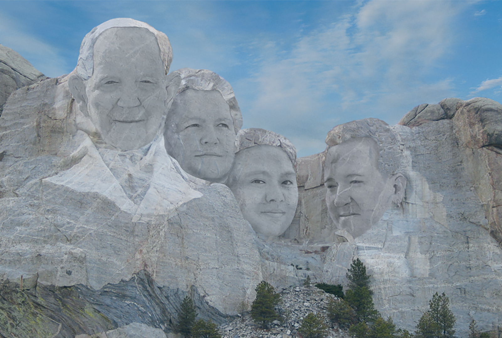
So there I was on a family vacation at Mt. Rushmore. I was taking the requisite photos from “the spot” next to the railing and I began to wonder how many thousands (millions?) of people have taken this exact picture at this exact angle. So I decided to change it up and next thing you […]

